Visual Display Tips for the Non-Artist in Each of Us
September 19, 2016

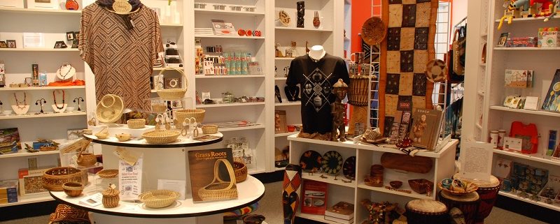
Shoppers are visual human beings. Their first impression in your stores is driven by sight. Familiarizing yourself and your staff with a few basic design principles is all you need in order to start making a better first impression. You do not need an art background or visual merchandising experience to improve your store visually. This last thought is what I wanted to explore. My intern, Annelyse Juin, was my willing visual display student. Annelyse had no previous display experience and is currently an advertising major at the University of Florida. With just the following tips, she was able to create the sample displays used to illustrate this blog.
Tip #1: Understand the difference between visual merchandising and display. Larger stores have the luxury of creating a vignette (display) separate than where the bulk of the product is stacked and stored (merchandised). Since Museum Stores tend to be smaller, displays often double as merchandising. Make sure product is easy to remove and accessible within a display, try not to make your customer reach or stoop to get to a product. Do not create a “booby trap” by making product difficult to remove. Also, the overall impression should be that your store feels full, warm, and inviting. Avoid making the store impression to be as stark as a museum gallery, or as overcrowded as a shelf in a big box store.
Tip #2: Create presentations using symmetry. Humans are wired to desire symmetry and balance; we want things in place and in order. New trainees are better at creating something symmetrical. Simply divide the space vertically with a bisecting line, whatever is on one side of the line match on the other with something of the same visual weight (about the same size and color). Triangles are a stable and desirable shape to build within a display, with the tall/heavy objects in the middle and the sides tapering down with smaller product. Keep it neat, clean and orderly. Do not turn items at angles, have them all face either front or back.
Tip #3: Keep displays balanced and play with the excitement of asymmetry. Basically asymmetry is when you use that same bisecting line as your fulcrum/balancing point, but you use equal visual weight as your measure of balance rather than mirroring. So a grouping of smaller product can balance one larger product. Color is such a dominate force, please realize that product of darker and brighter colors hold more visual weight. Repetition of the same colors throughout an arrangement will help your display feel more unified. Asymmetrical display is more challenging to master, but is perceived as exciting and unexpected to our eyes. If you are seeking out a way to make your space more interesting or dynamic, try re-grouping your product asymmetrically.
A quick word on the use of pre-visualization that will help you and the non-artist with visual presentation – buy product with the end display in mind. While you are shopping for store merchandise, try to imagine what the display will look like in your head. With a color theme in mind and using the exhibit as inspiration, buy a varied product mix. Match the branding of the exhibit with your merchandise; keep it on theme and within your museum’s mission.
These suggestions aren’t rules; this isn’t the only way to develop a great display and those first impressions but a good place to start. Have fun with your product arrangements/groupings. Encourage your visually gifted employees to teach others their ‘instinctual’ display tricks that they use to make items look more appealing.
A special thank you to my intern, Annelyse Juin – interns rock!
Kathryn Rush, Museum Store Manager, Harn Museum of Art


Leave a Reply
Want to join the discussion?Feel free to contribute!